Delicate olive has a noble color, so a kitchen designed in similar colors is always stylish and original. in olive color has a number of features that must be taken into account in advance when choosing the main shade.
Pleasing cuisine
Nuances of olive interior
The benefits of this are innumerable, just look at the photo of olive shades: from pale green-yellow to dark marsh. Everyone can find a shade to their liking here, but when using it when decorating a kitchen interior, a number of nuances associated with this option should be taken into account.
Interior features
- Such tones reduce space, so for small rooms only an olive-colored accent design is possible.
- The kitchen should be well lit. Ideally, it should be on the sunny side, but if not, then as a compromise, you can place additional lamps above the working and dining areas.
- Olive color Suitable for absolutely any style, with the exception of Gothic. Particularly suitable are Provence, and.
- Accessories for such a kitchen can also be selected according to the theme: tiles with an olive image, curtains and wallpaper with floral ornament, decorative wall elements, photos and paintings.
Color palette
 A monochrome olive interior is not very attractive and can quickly become boring. The optimal combination would be with other colors, the information below will help you choose which ones.
Ideal Olive Partners
- White and its entire palette. The most advantageous combination in the design will be a milky background of the walls and a rich color of the set, or vice versa - wallpaper in olive shades and light furniture.
- Brown and natural wood color. The use of dark tones will help you create a truly aristocratic, discreet design. This will create exceptional depth of color and highlight the beauty of the olive. It is usually bicolor, with the fronts being olive green and the sides dark. You should use black with caution - such a proximity will make olive dark and dull. Olive-chocolate furniture against a background of neutral walls is exceptionally beautiful, examples of which can be seen in our selection of photos of finished design projects, located at the end of the article.
- Gray and silver shades together with olive form an incredible stylish combination. This design looks luxurious and modern. It is not necessary to use olive-colored furniture; you can choose the appropriate wallpaper or wall background. An excellent solution would be to choose silver curtains or wallpaper with a hint of silver.
Photos of fashion design projects often show another combination: an olive set, part of which is made of the so-called light wood color. Such a tandem cannot be unsuccessful, the main rule is beautiful interior- balance between colors. Typically the main color is used percentage for 60% of the room area, additional - for 30%. Thus, it should be approximately half the size of the main one. Approximately 5% are interior accents, such as a vase, painting or souvenir.
Raspberry, pink and orange colors, but they must be used with caution so as not to spoil the impression. For example, kitchen apron or wallpaper of this color will be inappropriate, but dishes, curtains and decorative elements will add the necessary zest to the interior in clearly measured quantities.
Small tricks when decorating a kitchen
 Usually when creating kitchen interiors Some rules are used to help combine attractiveness with functionality. Olive kitchen will be no exception, because comfort and practicality are also needed here.
Olive interior rules
- A combination of olive walls and dark furniture will help make the room look respectable, while it will look less pretentious against the backdrop of an olive-colored wall.
- Beige walls (you can choose any other white shade) are an excellent background for a soft olive set.
- The accent interior is no less attractive: curtains or an olive-colored tablecloth together with dishes or lamps of the same shade will create the desired effect.
Which combination of accessories to choose depends on the interior design used.
It is characterized by home textiles, colorful curtains and light walls with paintings and embroidery. Functional household appliances in this interior it goes perfectly with ceramic figurines and touching homemade napkins.
 The classic interior is decorated in calm colors, without sharp contrasts and accents. The walls should not be too dark or have a clear pattern. The maximum “excess” is vertical stripes or textured wall surfaces. Even classic curtains should be as simple and practical as possible.
 For a high-tech style, a combination of fairly contrasting shades, but without excesses, is more suitable. The laconicism and simplicity inherent in this trend do not allow for excessive pretentiousness and a large number of accessories. “Classic” high-tech does not accept decorative elements at all, but modern design is rarely complete without several paintings, panels or other wall decorations.
 Whatever style you choose for your kitchen, olive color will make it extremely attractive and cozy.
A home kitchen decorated in olive color is an unusually cozy and stylish design, which is distinguished by elusive sophistication and at the same time simplicity. Creating such a combination is not easy. It is necessary to clearly select the desired shade and combine it with a companion color, maintaining proportions that are comfortable for the eyes. A modern range of products of the desired shade will help to simplify such a task: nowadays it will not be any problem to find matching curtains, wallpaper or dishes in this attractive color.
Olive tone is a derivative mixture of several fundamental shades, namely green, yellow and gray. It is thanks to its serious “pedigree” that this color is fraught with the most best qualities taken from each of its fellows, for example green is a symbol of the rebirth of nature, yellow gives a charge solar energy, gray symbolizes the ground under your feet and self-confidence. A bedroom in olive color will constantly remind its owners of its extremely positive origin, and the psychology of the undertone will give a charge of vigor and faith in a bright future.
Olive color, due to its noble origin, fits very organically into an interior made in a classic style.
What shades does olive go with?
When choosing an accompanying palette, it is important to pay attention to all shades of natural origin - this can be sky blue, turquoise, fresh grass, the color of the sun, the color of orange foliage, rich eggplant, and also an earthy gray shade. In addition, olive color looks incredibly beautiful in addition to pure white, cream, chocolate and even black.


Olive bedroom decoration.
- Fashionable in lately striped wallpaper will help to present the olive palette favorably; the strip should include the following shades– white, olive, green apple and yellow. To such bright wallpaper you should choose a muted, discreet shade of the floor - gray, beige, sand. The ceiling can be left pure white.
- Chocolate tone walls will look great with olive textiles. But so that the olive bedroom does not seem too dark, rooms facing the south, sunny side should be decorated in such a light-absorbing palette. A light cream floor and ceiling will look great with chocolate walls.
- A solid light olive color will look very harmonious with white furniture, dark rich brown laminate and a white ceiling.
- To create a muted atmosphere, the walls can be decorated in black, then olive textiles (curtains, bedspreads, floor carpet) will act as a natural brightener. In this case, it is better to make the floor and ceiling either light gray or pure white.
- The blue tint of the walls, together with olive details, will look both fresh and catchy, so this interior is suitable primarily for people who have a special love for bright shades in room design.
- The natural appearance of olive color can be emphasized with artificial stone present in the decoration of the bedroom walls. The stone will look very harmonious at the head of the bed.


Furniture for an olive bedroom.
- A bedroom in olive tones present in the wall decoration will look very harmonious with white furniture, as well as chocolate, gray and caramel.
- Olive furniture will look great against the background of white walls, so if you want to purchase an olive wardrobe, bed and bedside tables, then the shade of the walls should be as light and neutral as possible.
- Against the background of chocolate walls, a bedroom set in light colors, ideally white, will look most advantageous, and to emphasize the main color, you should choose a lot of olive details for the bedroom.


Bedroom decor in olive color.
Did you know that any massive color accent in the interior will set the tone ensemble as a whole?! For example, an interior with pure white walls, a white ceiling and a gray floor in addition to olive curtains on the windows, the same bedspread on the bed and a floor carpet will seem not white, but olive. A bright palette can attract attention, which is why many designers recommend decorating rooms in neutral colors, so that over time, when all this neutrality gets boring, they can complement the interior with bright details, and end up with a lively and updated room design. But back to our main topic, the olive color in the bedroom interior can appear in textiles - curtains, bedspreads, floor carpet, decorative pillows, canopy. And also in a whole range of other complementary details: chandeliers, lamps, sconces, floor lamps, photo frames, boxes, figurines, etc.


Gold and olive in the interior of the apartment:
A bedroom in olive color will give you a boost of energy in the morning, peace in the evenings, and will also bring confidence in the future into your life, because this beautiful and mysterious palette has precisely these psychological aspects. And in we talked about green curtains for the bedroom, we recommend you study them!
The Decorol website invites its readers to start receiving notifications with site updates (you can subscribe through the form in the sidebar).

How to get olive color? Olive color is a mixture of green, yellow and gray. And nothing else. Many people claim that olive is a “dark green” or even a “dirty green.” But there is simply no other, more correct definition of olive. The color I'm reviewing in this article is considered a classic color. modern designs interiors. At the same time, using it is quite problematic. The reason for this is the active absorption of light, followed by darkening of the entire space of the room. To rid the olive color of negativity, you need to combine it with other, compensating shades. What color goes with olive? I will talk about this below. website
Olive and brown colors in the interior
Despite the fact that chocolate-covered olives are another dish, in interior terms these two colors look simply great together. The reason for this is their ideal compatibility. But! Let me remind you that, like olive, brown is also a light eater. To prevent this, you need to bring light into the room yourself. It is better to do this not with the help of lighting sources, but with the help of ordinary white inserts or white decorative elements. For example, in case olive color walls or curtains and sofas upholstered in brown fabric and other furniture, snow-white pillows or light paintings in white frames on the walls will not interfere. At the same time, the interior will gain not only light, but also a certain elegance. In general, I would recommend experimenting with the olive-chocolate combination only if the room has many large windows facing the sunny side.
Combination of olive and beige
If the chocolate color is too dramatic for you, then you can replace it with a more neutral beige, which is also lighter. Instead of beige, you can also use cream or any similar shade of the sweet palette. Both the ceiling and additional accessories can be cream. Also, in this case, the café-au-lait color elements will not be harmful. Needless to say, they should not dominate the interior. If the room does not have large windows, then place many lighting sources. But the lighting must be neutral, or maybe daylight. The yellow light of traditional light bulbs can create an unfavorable picture.
The combination of olive with other green colors
Olive green color. As long as you use sufficient lighting and as long as you have white, you can actively combine colors olive oil with all shades of green, including pistachio, creating a kind of ecological interior. Many designers I know, in order to achieve maximum naturalness, recommend making green inserts alive. For example, you can put a small decorative tree on the table, or lay out a rug that closely resembles a real lawn. In combination with dark olive, such inserts will look impressive. Light olive color generally goes well with the fruit palette. But since this combination may seem too oppressive and saturated, use an additional third color, which can be terracotta, ash, ocher, dead straw, etc.
Olive color in the interior with white
I already said that white actively used with soft olive as an insert or accent color. However, no one is stopping you from creating a strictly elite olive-white interior, in which both white and olive colors will be equivalent. The compatibility is simply incredible, especially if you decide to install a white glossy floor. In this case, I would also recommend that you use wine-red or lingonberry inserts, which will make the interior more cheerful. But don't overdo it. Red is a heavy color, and if there is too much of it, the calmness of olive will be completely interrupted.
Olive color, photo:
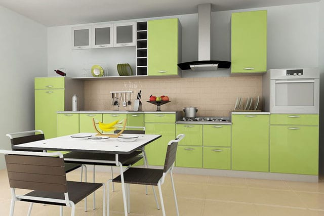
Olive kitchen:

Olive wallpaper:

Bedroom in olive color:
Representing a harmonious combination of yellow, gray and green, olive color in the interior represents stability, peace and tranquility. Having a specific property - the ability to intensively absorb light - olive color provokes some darkening of the room, which does not always have a favorable effect on the possibilities of its use in interior design.
Some consider the olive color to be old-fashioned, others - boring, and for some it even evokes associations... with a swamp. Let's try to dispel the myths about green melancholy, look for harmony and positivity of successful combinations in olive tones of the interior!
Olive is a complex color. And the priority of using its yellow-green or gray-green shade is a matter of individual taste. Organicity and completeness of the interior are often determined by the right combinations. So that the olive color does not seem gloomy and does not obscure the room, it is important to take into account two effective nuances when designing.

- Use in the interior sufficient quantity yellow (not white) lighting sources (not only a traditional ceiling chandelier, but also wall sconces, directional light spots).
- Incorporate refreshing olive-colored light shades into your room design. The best choice for these purposes is universal white, which will perfectly dilute the muted olive color. White stripes or patterns on the walls, a snow-white bedspread or tablecloth, and white curtains will look impressive as an accent.
The best duets and trios with olive
Vegetable olive color in the interior is most successfully combined with natural shades. In combination with olive, tones are chosen purely individually. It all depends on the functionality and spaciousness of the room. The photo shows the most successful interior combinations.

For example, bright raspberry accents will make olive kitchen cheerful. A living room in olive tones, where pistachio predominates in collaboration with fuchsia, will acquire a unique elegant style and grace. For a children's room or office interior, such a flashy color saturation is not suitable - it will be distracting.

An excellent combination: walls in light olive tones plus chocolate and white. These colors can be used alternately, or all together. The “dreary” olive interior will be perfectly diluted by white elements.
If such a contrast seems too dramatic, use a softer combination. This could be a combination of muted olive with “sweet” light shades of the caramel palette: milky, soft cream, coffee. This combination will smooth out the difference between colors.

Colorfulness and ambiguity dark olive interior bright, cheerful accents in the form of an orange shelf on the wall or fuchsia-colored covers on chairs will be emphasized.

Among the equally attractive shades that can be combined with olive color are bright yellow, orange, brick red, and carrot. Deep shades such as mustard combine well with olive. sea wave. In this case, the harmony of the interior will be complemented by sea green curtains or an elegant sofa in mustard tones.
Contrasts in the kitchen interior
Olive color in the kitchen interior can be used in different variations. The traditional “kitchen” combination most often used in the interior is the olive and brown color palette (chocolate, light brown, brown). Olive looks good paired with a contrasting color (yellow, light gray, white, purple, red). By using a brown tint palette, we will get a classic interior and a peaceful atmosphere, and by choosing contrasts, we will create a dynamic, newfangled style.

Most clearly emphasize all the advantages color combination Olive-colored furniture with a tabletop will help brown. It is advisable to make a light gray background dominant. Light looks good kitchen set against the backdrop of olive-painted walls.

As an additional accent decor, you can use orange textile napkins or a tablecloth, a wall picture, a clock, or photo frames in the life-affirming orange color. Invigorating shades of salad and mint are also suitable for design. Aquamarine, turquoise and fuchsia are another excellent contrast option for modern interior. Just don’t overdo it with the brightness of your accessories!

For eco-style lovers, the combination of dark olive and brown is a real find and a field for experimentation.
Restraint of color in the living room
The priority of soft olive, gray-olive colors in the living room interior without bright accent flashes emphasizes timeless classics genre. For classic style there is no need for color contrasts and bright decor. Pretentiousness is not characteristic of him either.

That is why olive color in living room design is best left muted and not combined with contrasting shades. A striped sofa or wallpaper in olive tones with a light beige-milky pattern will perfectly emphasize the intelligence and equanimity of a classic design.

Cozy olive bedroom
The bedroom is a place of relaxation, therefore the olive range of colors here should be conducive to calm and tranquility. Light “light” shades of olive color are most suitable for a bedroom interior. There are no flashy spots of color in this room.

The harmony of light olive, dim green and milky is interesting. If you combine these shades on curtains and furniture stencils, you can get a fun, unusual bedroom interior.

Sprinkles of mustard or brick will add originality to the room. This could be a floor lamp or bed sheets. As we have seen in many examples, correct selection the adjacent shade is very important.
IN successful combination In the interior, olive color will delight you with its elegance, style and creativity.